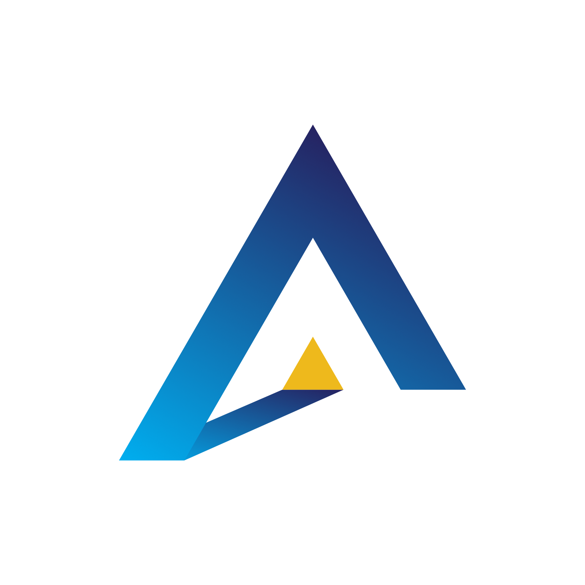
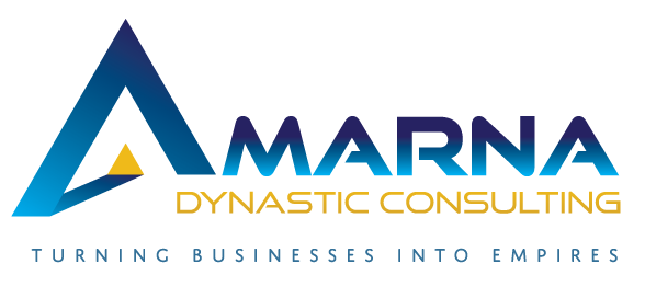
The logo serves as the anchor of the identity. Its geometric structure and upward-driven angles convey precision and purposeful direction. The gradient blues introduce freshness and depth, while the golden accent adds warmth and a hint of prestige. Clean, understated typography balances the strength of the mark.
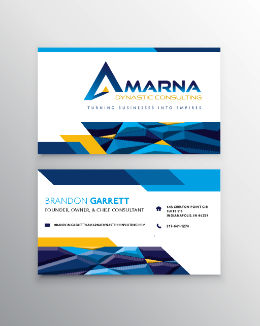
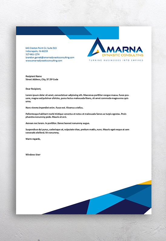
The color palette continues this blend of professionalism and warmth: bright cyan for energy, deep blues for trust and dependability, and rich gold tones for confidence and positivity. These colors carry consistently through the stationery system, reinforcing brand cohesion across every touchpoint.
The business card design uses layered geometric shapes to establish a dynamic visual rhythm without pulling focus from essential details. The letterhead follows suit, maintaining brand continuity with a clean, spacious layout and a lighter visual touch.
Altogether, this identity system delivers a cohesive, engaging brand presence that reflects both the ambition and the approachability of the business. It’s a modern, confident, and welcoming suite—well-suited for a consulting firm built on partnership and progress.