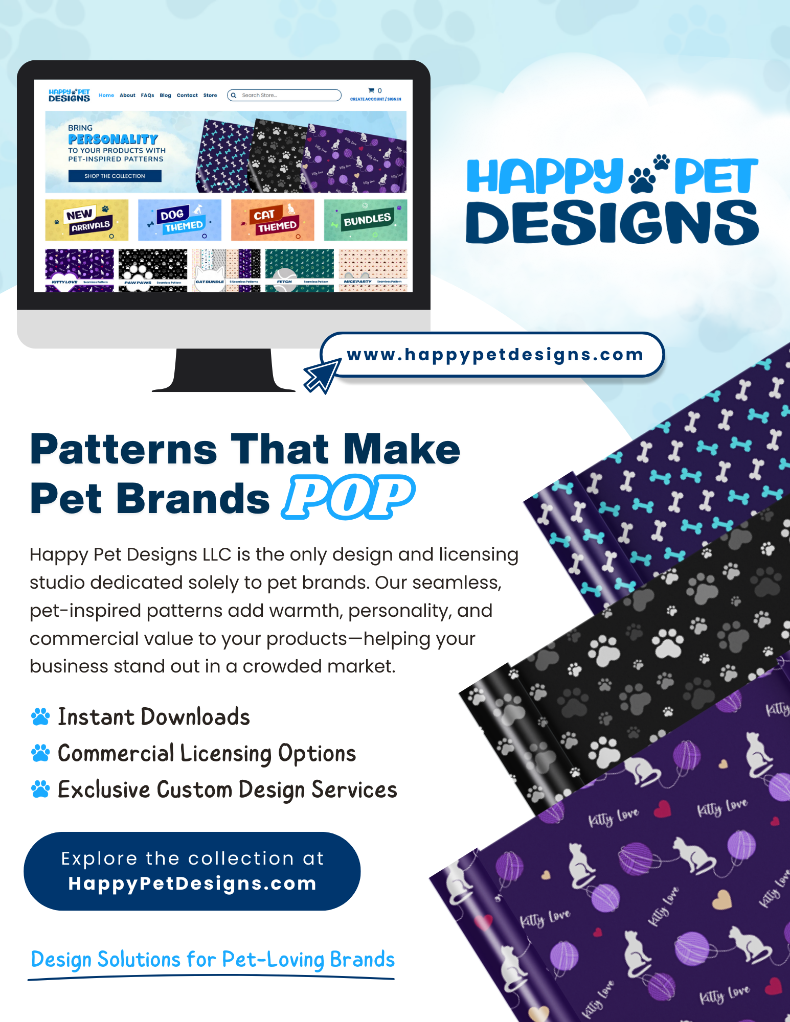
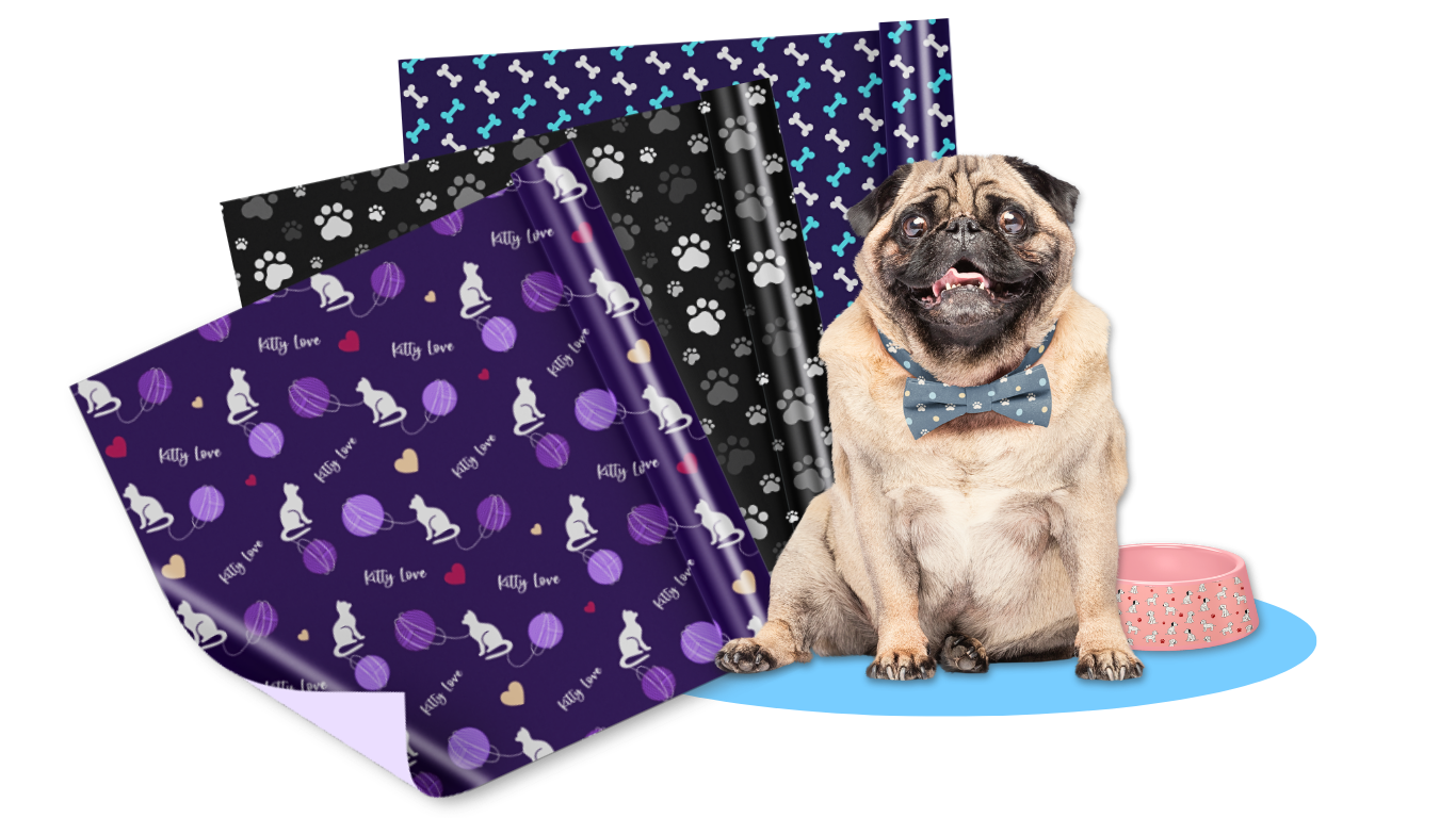
The layout was designed to feel dynamic yet easy to navigate. A website mockup displayed on a desktop screen builds credibility and shows visitors exactly where they can browse the collection. Layered pattern previews—featuring dog bones, paw prints, and cat-inspired illustrations—create depth and movement while showcasing the variety and versatility of the designs.
Content is organized into clear, digestible sections to maintain readability and engagement. A concise brand description establishes authority in the pet design space, while a focused benefits list highlights instant downloads, commercial licensing options, and custom design services. A bold call-to-action button anchors the piece, making the next step clear and inviting.
The color palette leans into cheerful, trustworthy blues that feel both creative and professional. Clean sans-serif typography keeps the layout modern and easy to scan, while generous white space ensures the design feels polished rather than crowded.
Overall, this project reflects my ability to blend strong visual hierarchy with strategic messaging. The result is a cohesive marketing flyer that not only aligns with the brand’s identity but also engages its audience and encourages action.