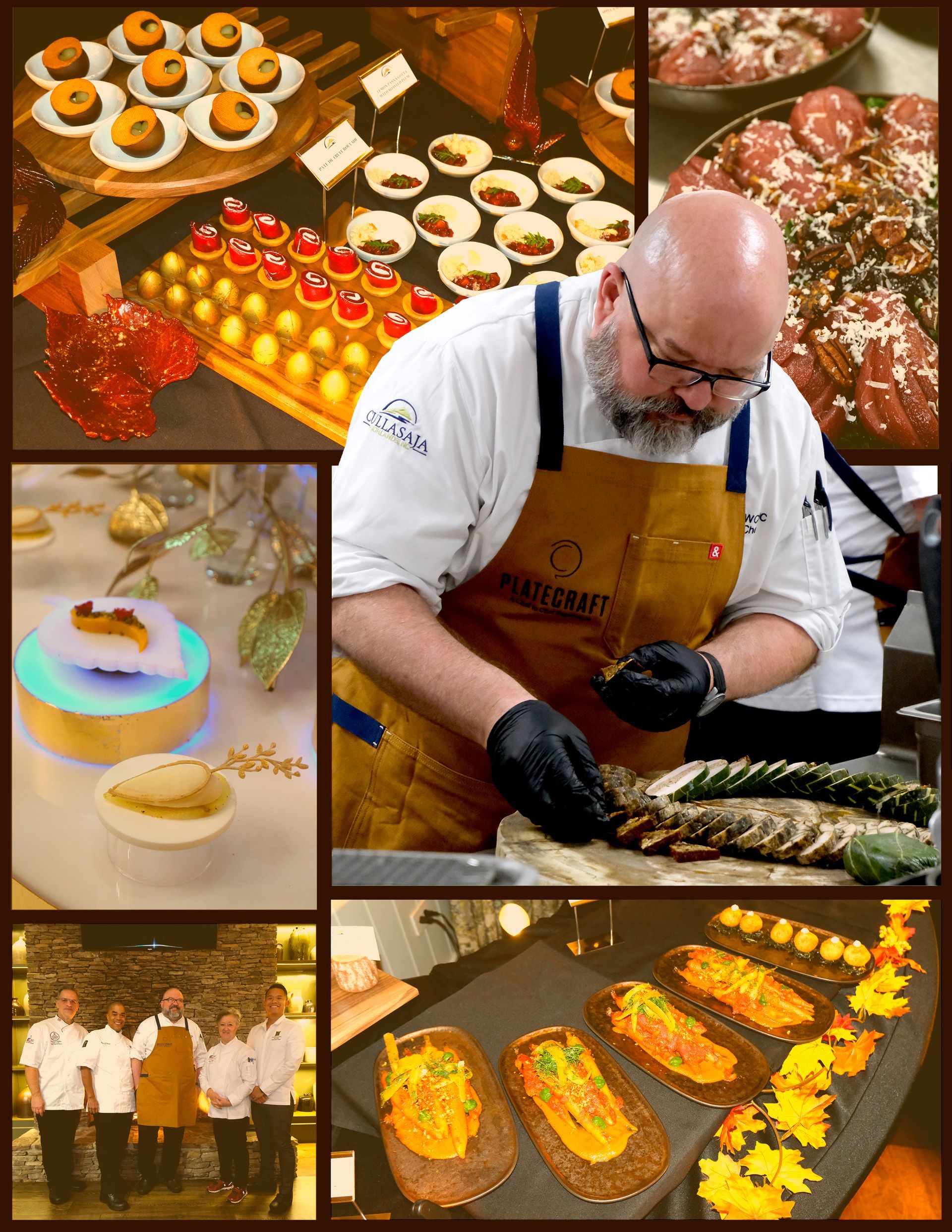
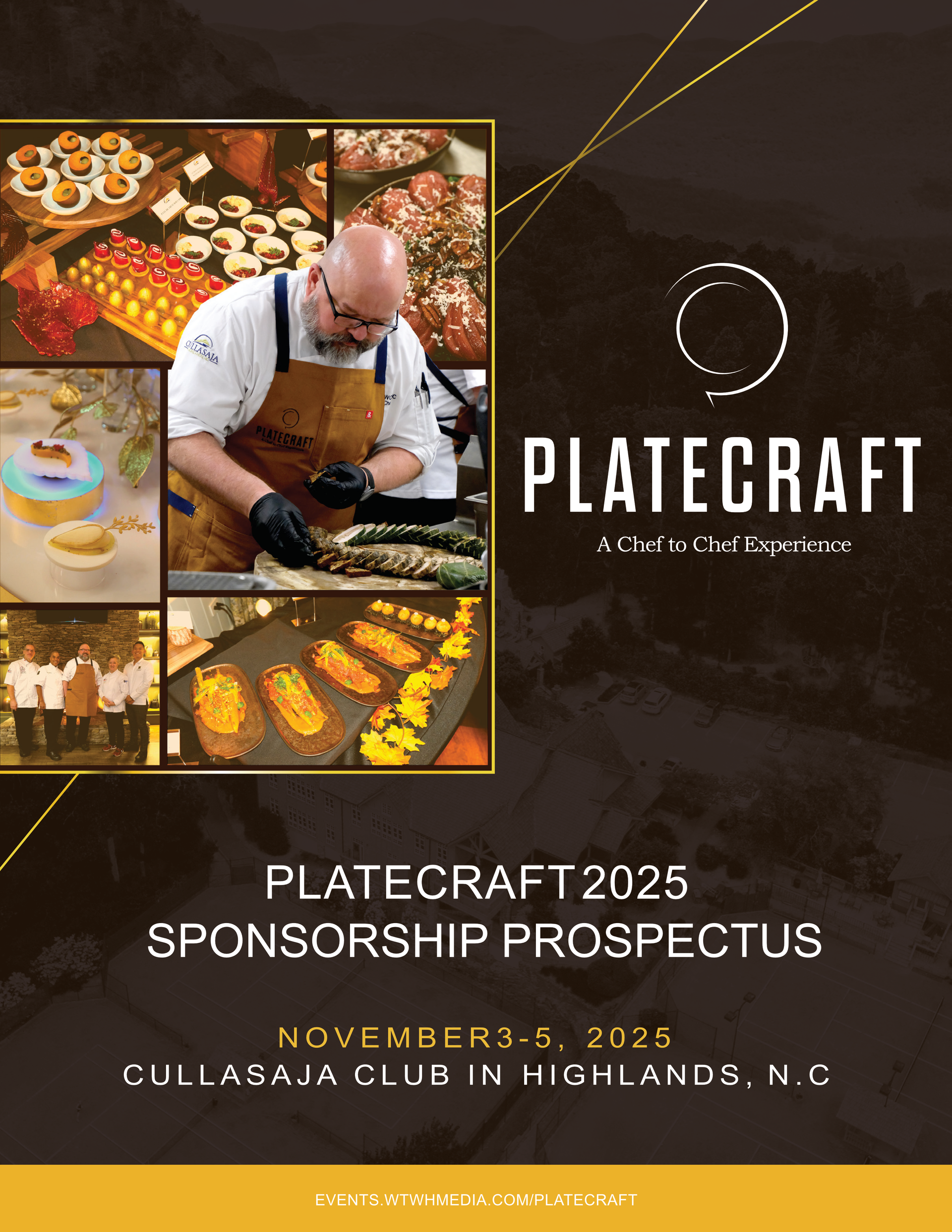
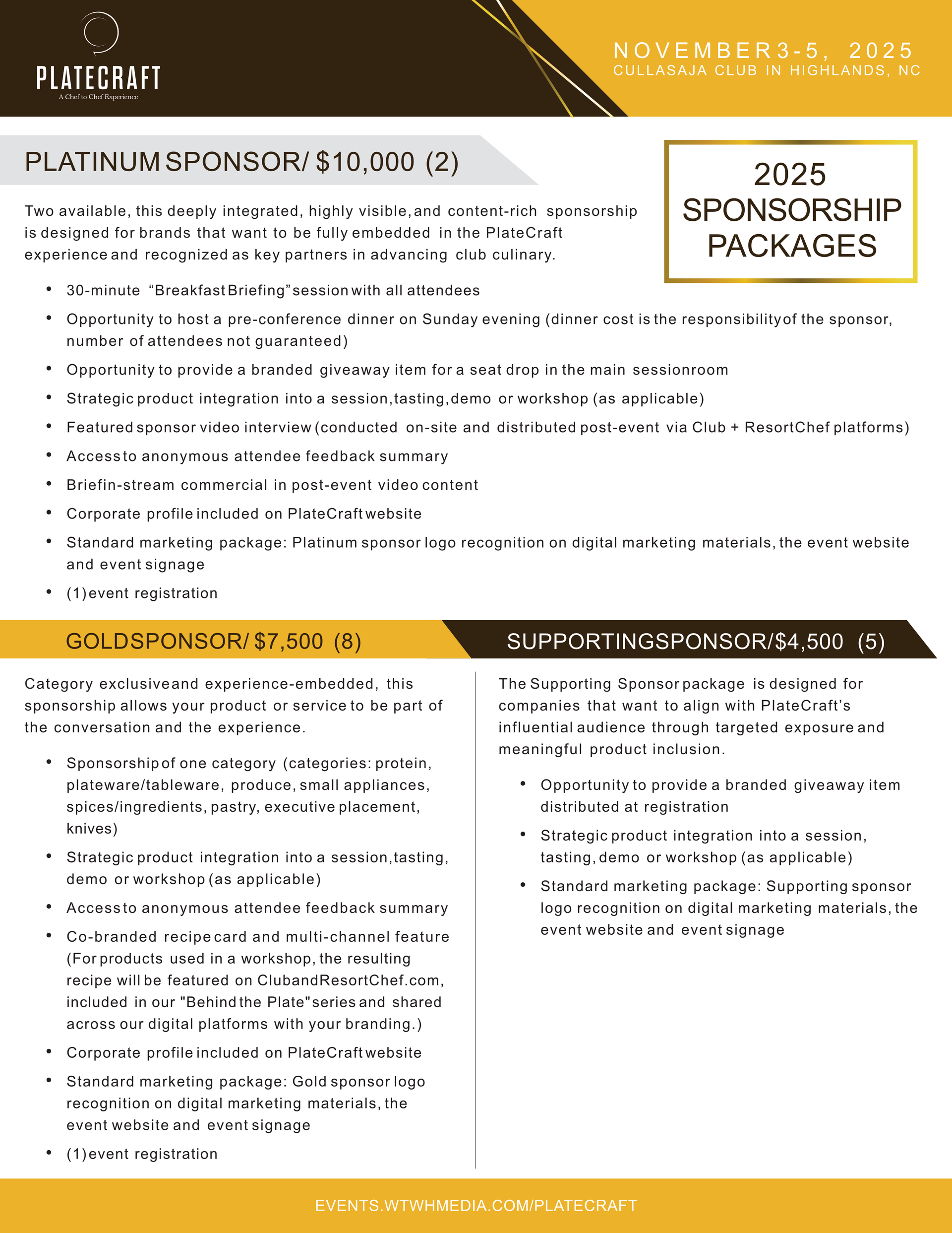
Visual hierarchy plays a central role. Sponsorship levels are distinguished through thoughtful use of color, typography, and layout shifts, making comparison quick and intuitive. Headings and callouts ground the reader, while consistent body copy treatment keeps the pacing smooth and professional. PlateCraft’s warm palette, geometric accents, and refined typography unify the piece and reinforce the event’s elevated culinary identity.
The final deliverable is a polished, print-ready prospectus that positions PlateCraft as a premier industry experience and gives sponsors a clear, compelling understanding of the value of partnership. The design blends aesthetic warmth with functional clarity, strengthening the event’s credibility and supporting the client’s broader marketing and outreach goals.